Card Management UX Revamp
Responsibilities
Interaction Design
Visual Design Research
My Role
About Project
Year: 2024 Platform : Web Team: 1 UX designer, 1 Product Manager, and 2 front-end Web Developers.
Tools
Figma & FigJam
Usertesting.com
Fintech Insights
I was the Primary UX designer on this project and led UX efforts from ideation to build with guidance from my Lead UX designer
As the sole designer in the team owning the Card management capability, I was a key contributor to this strategic initiative. I worked closely with the Product team (Product Manager and Developers) and UX leadership to discuss and refine how the capability could best scale based on all the features and ideas in our long-term roadmap. This eventually led to redesigning two key screens in the web banking app: the cards overview and the card details pages
Company : Nymbus
Nymbus is a B2B financial technology company that provides innovative banking solutions to help financial institutions modernize and stay competitive in the rapidly evolving industry. The company offers a range of products and services, including core banking systems, digital banking platforms, payment solutions, and managed services.
PROJECT OVERVIEW
PROJECT GOALS

The Existing Experience
The Scope
The current card management page is utilized by all Nymbus retail and business customers, few include Thrivent Bank, Gesa, Hustl, ConnectOne, PeoplesBank, Michigan State University Federal Credit Union, Locality, Venture On, and others.
the current design presents several limitations: it lacks scalability to accommodate customers managing multiple cards, has an unclear information hierarchy, struggles to effectively display associated transactions, is not optimized for mobile web responsiveness
The scope of this project was to redesign the card management experience to provide a more scalable and user-friendly banking solution. The revamp aimed to address longstanding problems and usability issues that had been exacerbated over time while enhancing both the user experience and visual design. By leveraging New MUI Components in our updated 2024 Nymbus design system, the solution aligned with evolving Nymbus customer needs to deliver a cohesive and intuitive experience.
User satisfaction Visually appealing interface designed to boost user satisfaction and engagement
Client adoption Increased adoption expected with faster time to market for banks
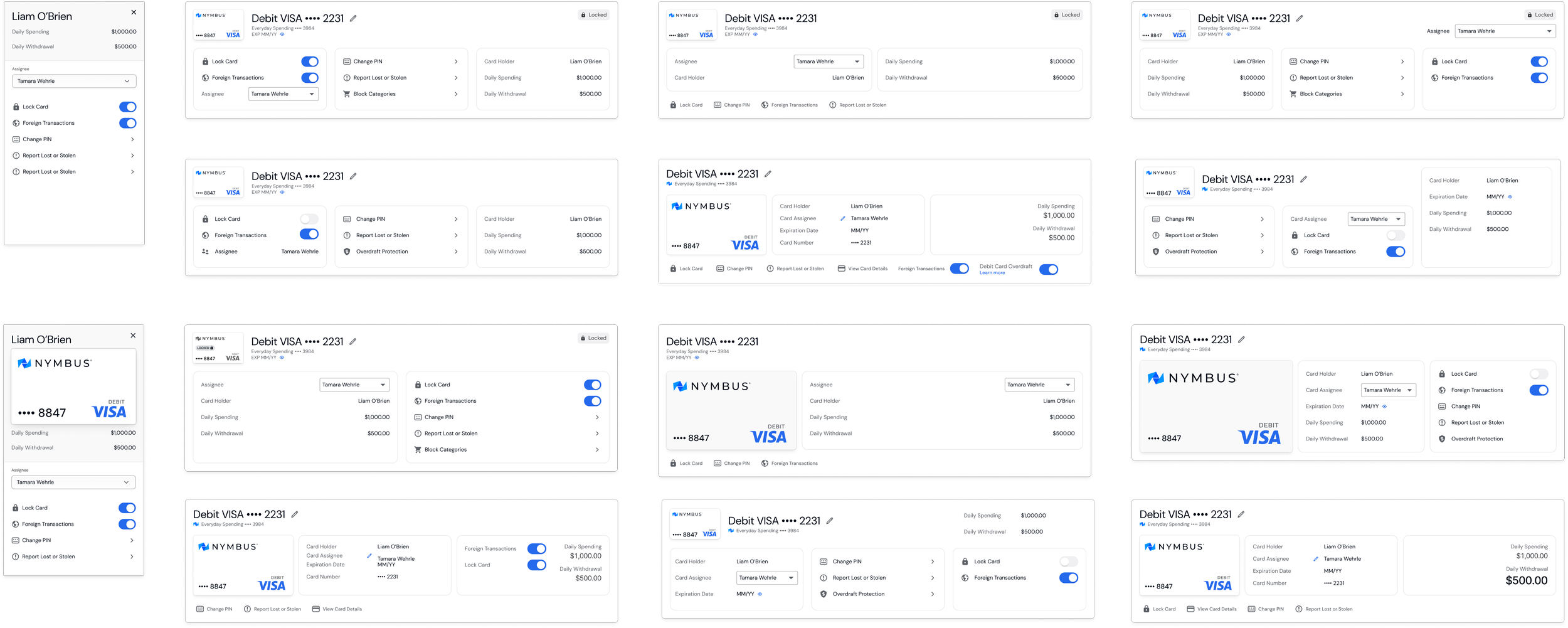
After exploring numerous concepts for the card tile design (and this is just half of them!), we meticulously tested responsiveness, scalability for potential new features in the future, and went through multiple rounds of design reviews, product team reviews and user testing. After gathering feedback and iterating, we finally arrived at the final version of the Card Management page.
Since Nymbus serves both retail and business customer banks, there are ideally two distinct user types:
Retail Customer: Individuals managing their personal cards through digital platforms, such as mobile apps or online banking.
Business Owners or Employees: Individuals managing business credit or debit cards for themselves and their employees.
Before diving into design concepts, I mapped out the existing user flow, incorporating user types: retail and business and their respective card types: debit cards and credit cards for retail customers, as well as business debit cards and business credit cards for business customers. This ensured all scenarios for quick actions were thoroughly addressed for each type. Additionally, I documented the four card states: Active, Inactive, Locked, and Closed to comprehensively cover every potential use case.
FINAL DESIGN
Card Management - Retail

Card Management - Business

WHATS NEW
Credit Card has minimal quick actions & details as we are integrated with i2C
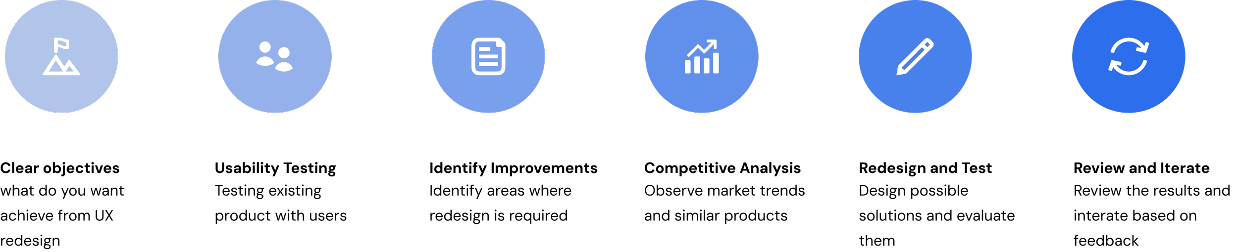
AUDITING THE CURRENT EXPERIENCE
Collaborating closely with Product and Customer Support teams, I facilitated discussions to evaluate how the capability could effectively scale to align with our long-term roadmap. Drawing insights from these conversations, I conducted a comprehensive audit of the existing features, identifying gaps and areas for improvement. This process enabled us to refine the user experience, ensuring it met both current needs and future goals.

REDESIGN AND TEST
Testing some concepts
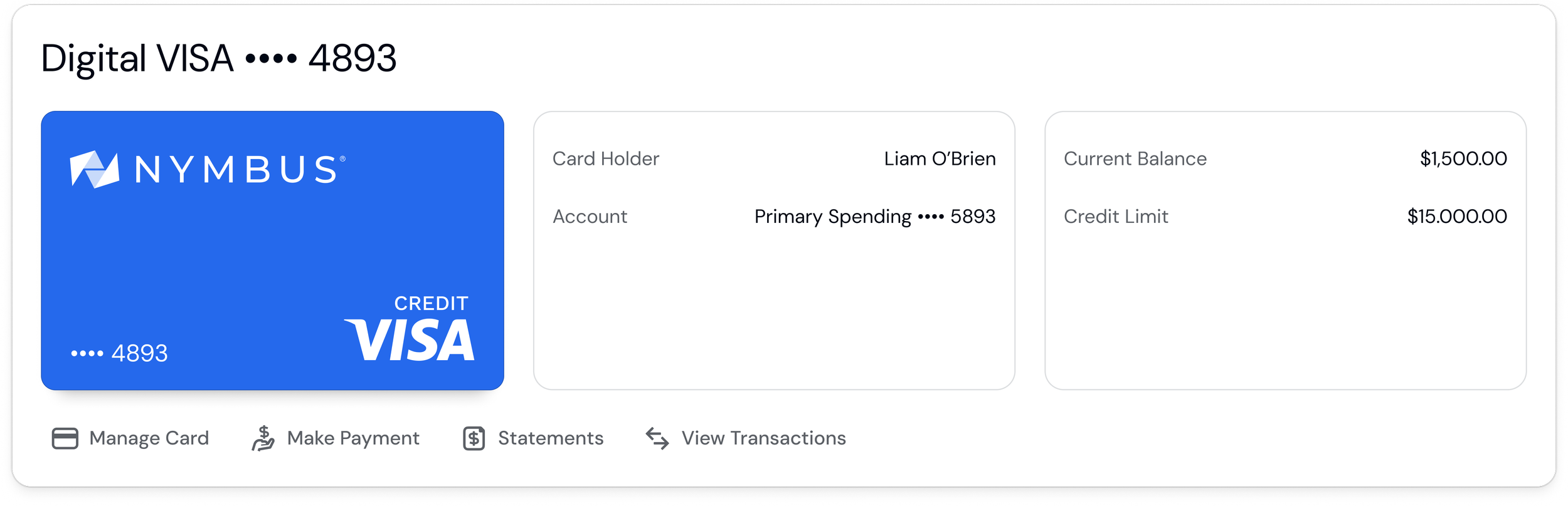
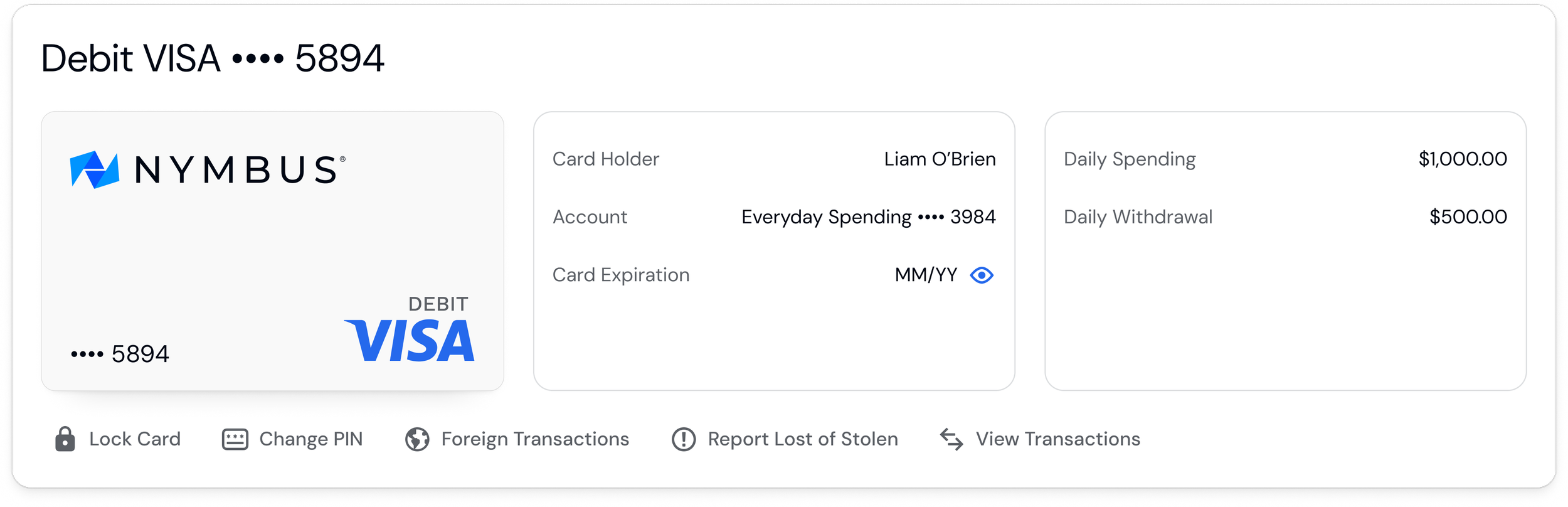
Enhanced Card Overview
Updated Layout The new layout offers a more elegant look, balancing information legibility and card imagery. By grouping similar data together such as card details in one section and information like daily spending and withdrawals in another ensures clarity and context. This approach aligns with accessibility best practices, making it easy for all users to identify and interact with card information,
Prominent Quick Actions Quick action buttons are placed at the bottom for smoother navigation
Scalability Enhanced architecture to support future growth and capability expansion
APPROACH
USER TYPES
USER FLOWS
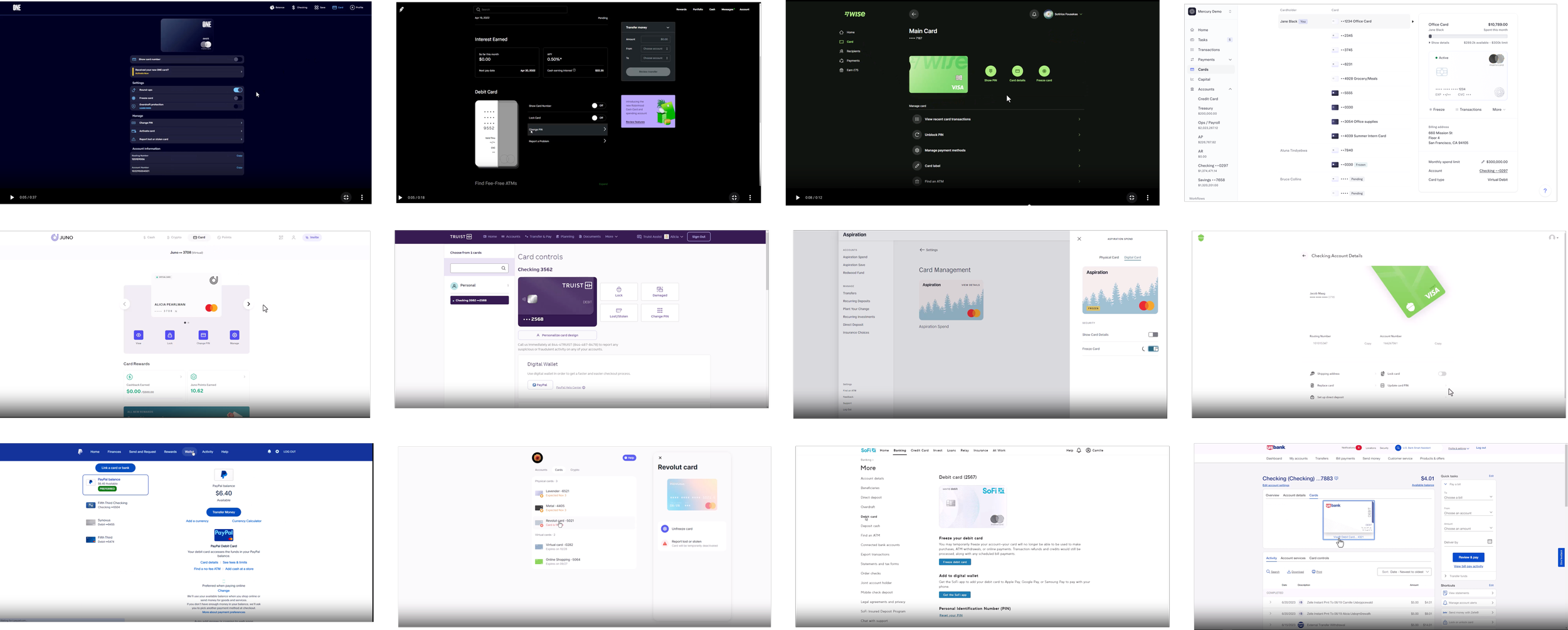
MARKET RESEARCH


Who will be using this feature?
Understanding the User flow
Using Fintech Insights, a tool that provides detailed user flow data from various financial institutions, I analyzed the card management feature across modern banking applications such as One Bank, Mercury, Revolut, Robinhood, and Acorns to name a few. This analysis helped me identify key industry trends, best practices, and areas for innovation to improve our offering.
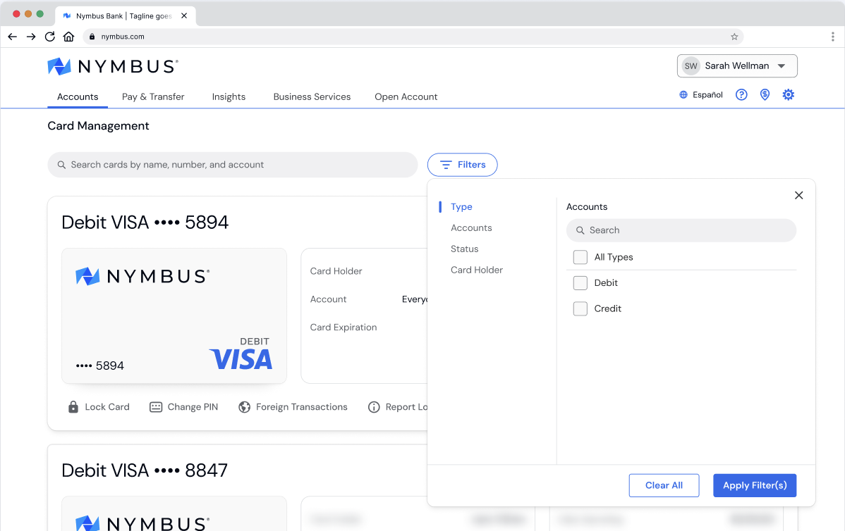
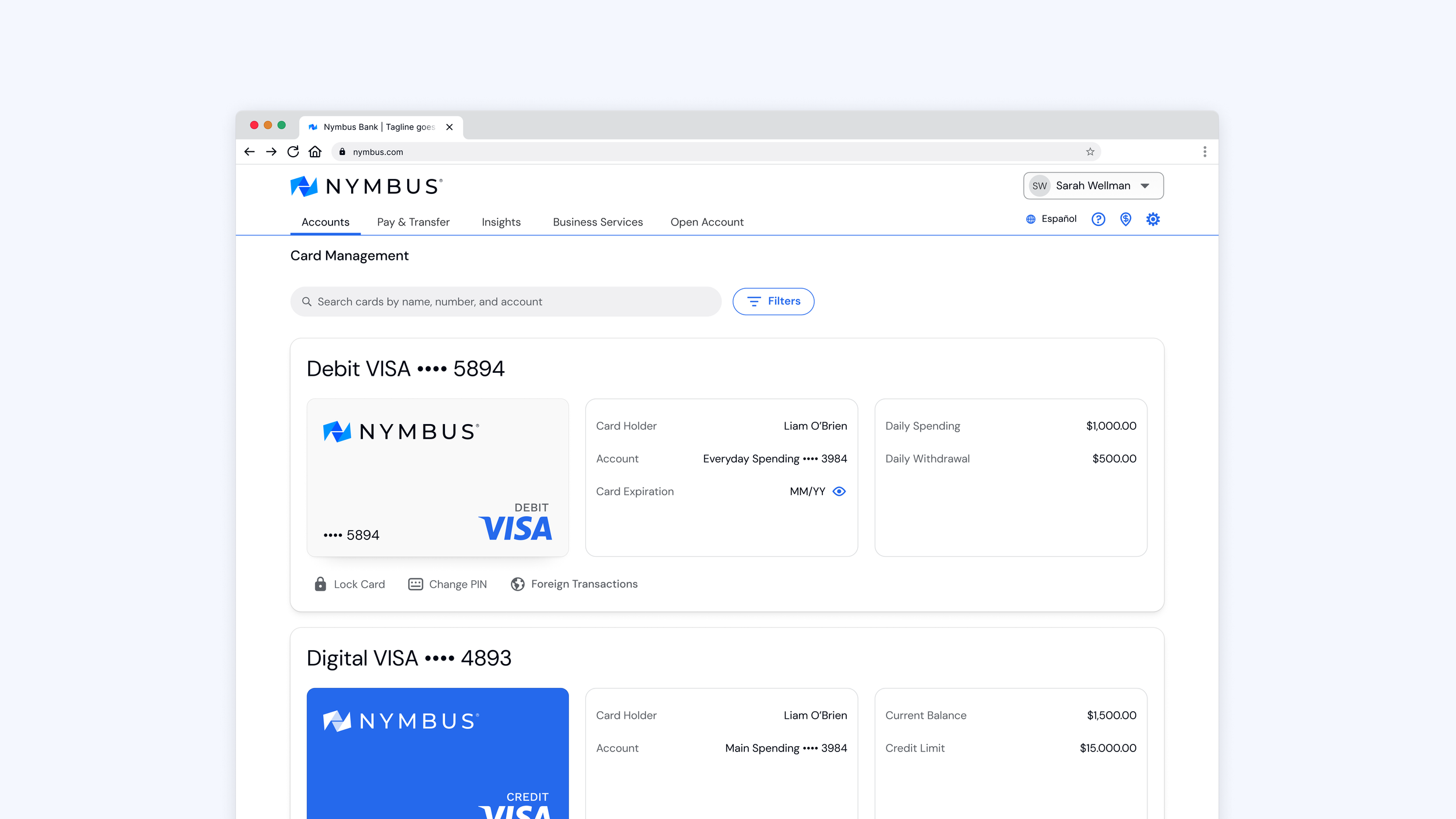
we implemented an enhanced search and filter system that allows users to filter cards by criteria such as card type, status, cardholder, and account. This feature provides significant benefits for both business and retail customers.
Business Customers: Many business users manage multiple cards, and the ability to quickly filter and find specific cards helps easily find cards and improves overall efficiency.
Retail Customers: As the platform adds virtual cards, the filter functionality will become crucial for retail users who may manage several cards, helping them easily find and organize them.

Search and Filter Functionality
Card-specific transactions
A quick action for transactions has been added to the cards tile on the cards overview page that takes the user to a secondary page to display transactions, allowing users to more easily monitor spending and manage finances for each individual card.

DEV HANDOFF
After finalizing the design, I handed it off to the development team, providing all necessary assets, including cards and badges, along with detailed specifications for size, shadow effects, and overlay details for the card statuses.

The new layout is now responsive across multiple breakpoints, ensuring a seamless experience on different screen sizes and devices.
Responsive Design
CONCLUSION
The redesign has been completed and implemented in our development environment but Nymbus clients are set to receive this update in the 03.2025 release. This update is crucial for maintaining Nymbus’ leadership in user-centric B2B digital banking services. Throughout this project, I’ve come to appreciate the impact of strong design and UX in inspiring the team and driving product success. As the new batch of improvements is rolled out to the customers, we will closely monitor performance and gather customer feedback to inform future iterations.
Design-driven product success

Card Status Badges
We introduced status badges (Activate, Locked, Closed) on the card tiles to give users an immediate overview of each card's current status. The "Locked" status is also clearly displayed directly on the card art for added visibility.